"Counting But Losing Count: the Legacy of Otto Neurath’s Isotype Charts”; by Prof. Pino Trogu

A new article on data visualization, by SF State School of Design Associate Professor Pino Trogu, has just been published in the current issue of Visible Language, the Journal of Visual Communication. Despite their widespread use, the article questions the usefulness of bar charts made up of repeated little human figures or little dots.
In the journal’s introduction, the editor Mike Zender states that: "Sometimes research creates breakthroughs that shatter paradigms. [...] Pino Trogu’s challenge to conventional wisdom, that representational pictures of data enhance comprehension, probes Otto Neurath’s Isotype and concludes that counting rows of pictograms is not as effective for reaching a total as reading an arabic number. These studies confirm the usefulness of design research to practice and support their integration. [...] One step, one study at a time, Design is passing from adolescence to adulthood."
Read the full article here (pdf)
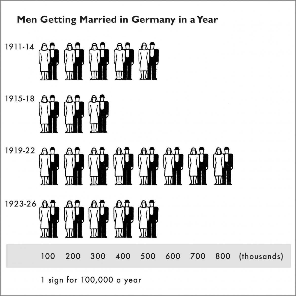
In a typical Isotype chart, counting symbols and multiplying them by the scale factor is not an effective strategy for reading the data. Adding an X-axis with numerical labels greatly improves these charts.

Prof. Trogu took a selfie with Otto and Marie Neurath while visiting the Museum of Economy in Vienna in 2015.